

22 Oct 2020
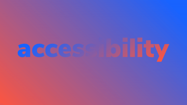
Design For Accessibility


Pavan Thallapally
#Business | 7 Min Read


Since its inception, the human era has evolved through cognitive, scientific, and industrial revolutions, and experts around the globe have designated this era as the Information age. With these natural selections, we designed principles of life that are replaced by the digital world. In these physical and virtual environments, humans have started thinking smartly to increase experience, improve productivity, and reach out to the world as identity. This will help humanity to make better decisions and future actions for sustainable movement in human destiny.
These digital products enable food, communication, travel, health, and many global society things. Tangibly, human beings are adapting to these products; however, some problems need to be solved for the humans who are impaired permanently, temporarily, and situationally. Solving these accessibility problems discards social boundaries, improves natural ways of interactions, reduces errors, enables seamless transitions, and market reach out.
Designers design a product by empathizing with the target personas, who are represented by their mental model, and then being inspired for choices and decisions to add emotions, navigations, and solutions. But to diversify the product, it needs to embrace all the aesthetics to interact with the product. Below are the checklists and common mistakes committed while designing.
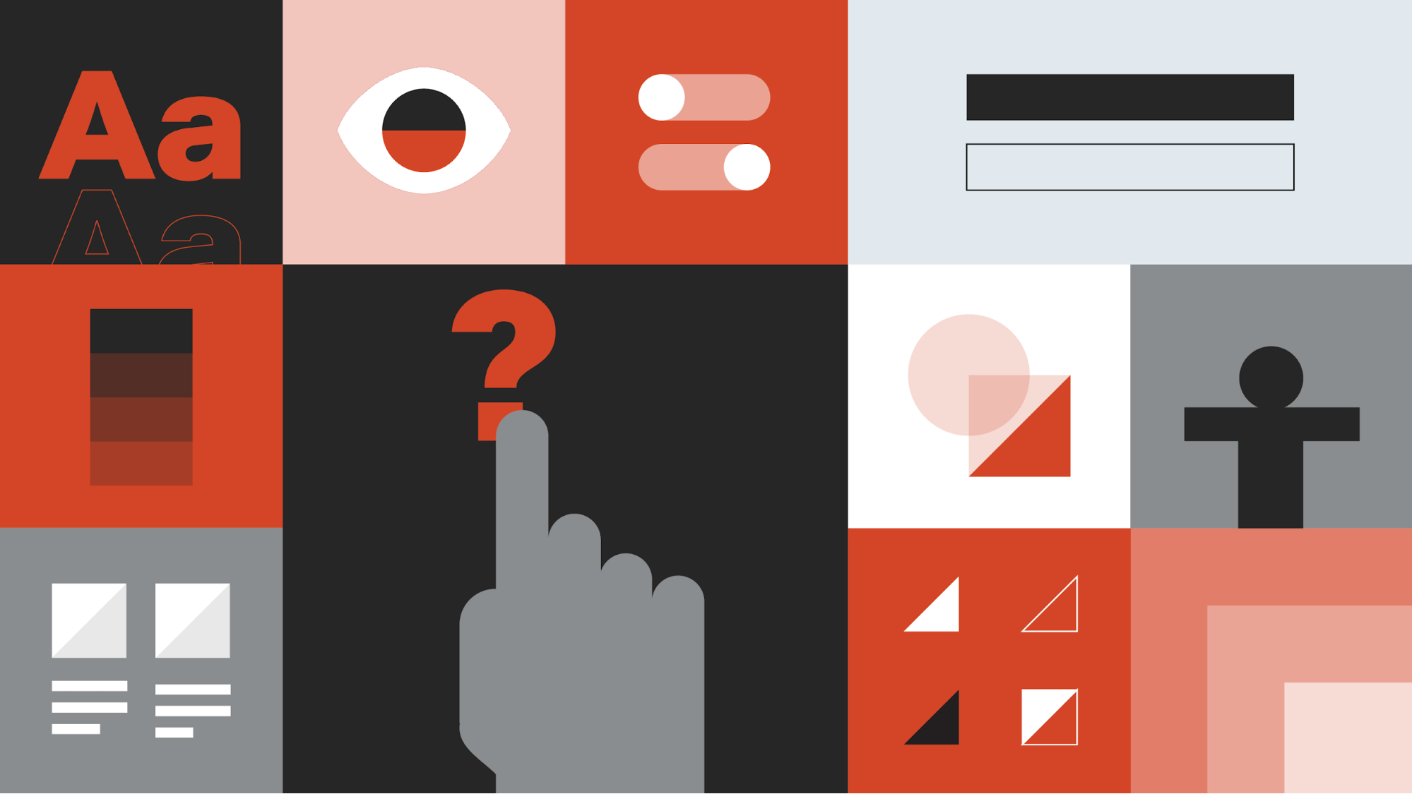
Quick checklists to consider
Textual Representation
- Avoid complex vocabulary and describe it with fewer words.
- Guide the content with visual hints like icons and images.
- Design with simple hierarchy and navigations.
- The information should render across all devices, different resolutions, and without overlapping the text.
- Develop the text and elements larger by default so that it renders across all types of devices.
Hierarchy
- Headings drive navigation of users from one section to another, which also helps the assisting technologies.
- Listing the order or groups to describe the collective information.
- Notifying warnings, errors, and success statuses for every corresponding input label.
- Helping with subtitles and voice over and taking voice commands from the users when engaging with audio, video and other media-related content.
Color Contrast
- Keeping interactive elements with better contrast ratios.
- Always combine colors with visual cues for better interactions.
- All the textures, patterns, and paradigms need to be described with actions and content.
- Ensure all the elements will receive and understand equal amounts of information.
- Use plugins to your design tools to simulate the color principles like stark etc.
Input Devices
- All the elements and content must be operable by keyword, pointing devices, much more.
- Make sure the focus of the element is applied on the screen for every navigation.
- Adding the visual layout to see the keyboard focus.
- All the images, icons, graphs, charts should have an alternative text to understand.
Access to assistive technologies
- Allow assistive technologies to read and take the inputs.
- Enable the product for various assistive technologies.
- Testing all the user journeys with real users for better user experience and usability.
Social Privacy
- Awareness of privacy and data access.
- Visibility in storing and deleting their data.
- Product availability in offline mode.
“ Addressing accessibility in the design system is the right place to start your inclusivity efforts because it’s the foundation of your product.”
Common mistakes committed while designing
Typography
Humans with visual impairments can find certain letters and styles confusing. Therefore, potentially confusing letter heights, weights, lengths, and sizes must be clearly defined.
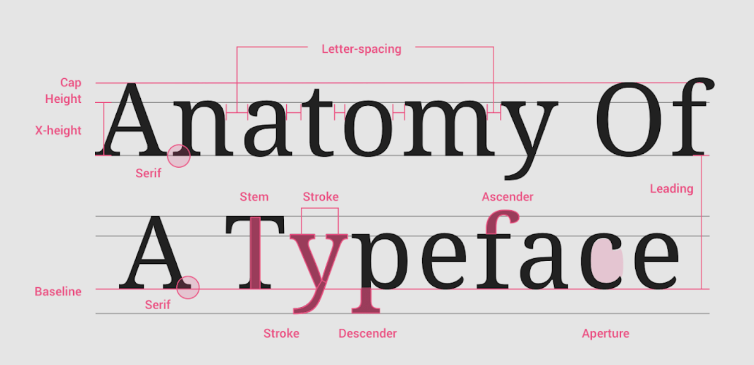
- The line-height Web Content Accessibility Guidelines recommend a value of 1.5 for body copy. Evaluate, reduce, or increase as necessary.
- Scanning long lines of text is testing for your eyes. Research indicates that the average online line length is around 70 – 80 characters. Limit lines to no more than 16 words.
- Centered text is not accessible text. The act of centering creates different starting positions. This creates issues for the visually impaired.
- Never use ‘ALL-CAPS’ in body copy settings. Use Small Caps if short-length capitalization is required. They are great for emphasis, abbreviations, and subheaders
Contrast
There are a lot of things to consider when making your content accessible from a color and contrast perspective, including:
- Be careful with light shades of color, especially grays–they are difficult to see for people with low vision.
- Ensure the icon fits into equal sizes. If some have circles in it, make sure these circles have the same diameter. Icons should have a consistent style.
- Do not rely on color alone to convey info to your users. For example, make sure your links have underlines or some other visual indicator besides color.
Layouts
Remember that a designer and an artist are different professions. In design, we create a product for people, which means your creative impulses can be applied only to not interfere with the user experience.
- Avoid experimental positioning of elements on a screen/page/card without good reason. Otherwise, the user may get confused and leave your site or delete the application.
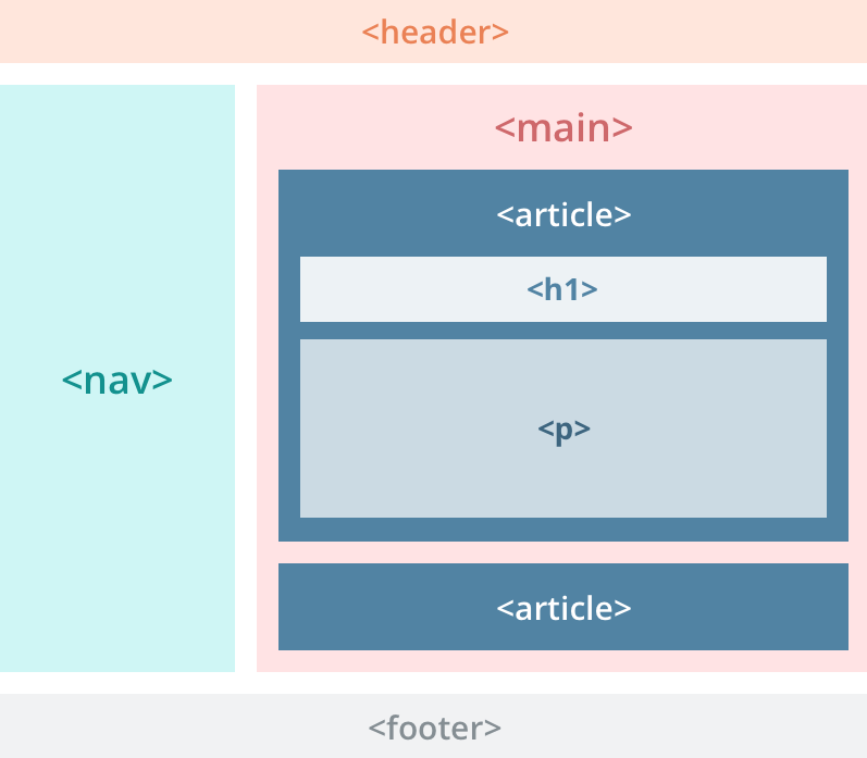
- While considering the structure and layout, we should also consider using a mouse, keyboard, touchscreen screen, or another adaptive technology device. Once this skeleton structure is ready, the styling of each sentence and paragraph comes into the picture.
- It is essential to check with the developers about screen sizes; a website design may be challenging since it will be used on a wide range of devices. Because front-end developers usually don’t have a design background and will implement the design exactly how it was provided to them.
- Use provided heading styles in correct order to create structure. Avoid formatting headings manually to be large and bold.
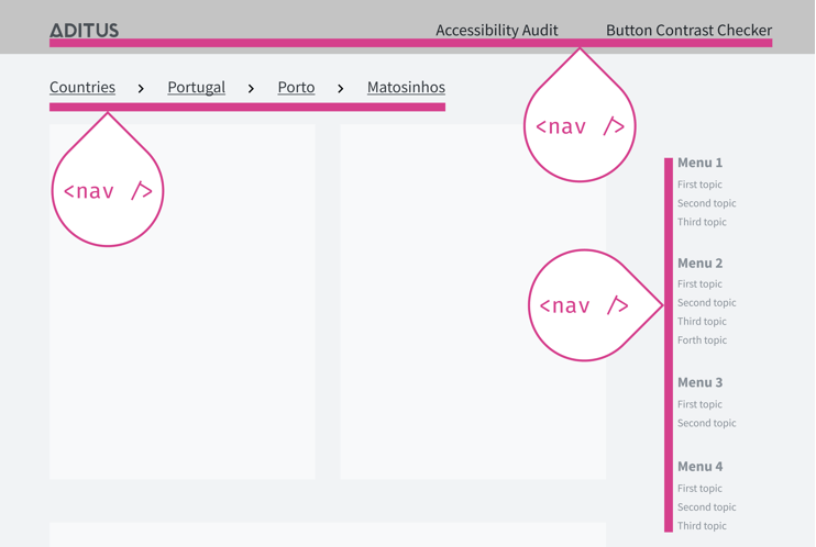
Navigation
Without a doubt, the most stalling aspect of any user interface is usually the navigation. So, dedicating extra attention to this area will inclusively improve the experience for all types of users. Bear in mind the following tips to reduce confusion:
- When linking, use anchor text that sets realistic expectations.
- Maintain anchor text consistency when two links lead to the same destination.
- Implement breadcrumbs to convey where the user stands in an event sequence.
- Highlight the current keyboard focus (for input fields, a blinking cursor isn’t enough).
“Accessibility is solved at the design stage.”
Why designers should consider accessibility while making design decisions.
User actions have a vital role in the application. So, for every action that the user takes is preceded by a designer’s decision and plan. It helps users complete their tasks with a better experience and navigation.
- While making decisions, you’re likely to discover and correct usability problems that affect the users so that you are also solving users with the age-related accessibility needs that are rapidly growing customer segments.
- Businesses want to avoid claims of discrimination and legal action when they launch the product in the market. So, designers will help them by implementing accessibility standards.
- Before it goes to development, design decisions while building the prototype model and usability save development time and stakeholders investments.
- One more advantage for developers and designers that websites are created with accessibility in mind is a higher-quality code base. For example, accessibility testing tools such as the a11y® testing platform can also identify errors that make general usability problems.
Conclusion
The accessibility principles benefit humans with disabilities, including expanding your customer base, polishing your brand image, increasing your search engine rankings, and making general improvements to usability.
References
https://rangle.io/blog/can-a-design-system-be-accessiblee
https://www.granite5.com/
https://www.bounteous.com/canada/node/63166/?lang=en-ca
https://dzone.com/articles/guide-for-htmlcss-developers-creating-layout-per-w
https://www.aditus.io/patterns/multiple-navigation-landmarks/
Read similar blogs
Blog

02 Nov 2022, 5 min read
From Cloud First to Cloud Serious
Despite the fact that cloud is over a decade old, many cloud strategies still focus on understanding and migrating to cloud, as opposed to fully exploiting cloud from a business and IT perspecti…
Blog

21 Oct 2021, 13 min read
Putting the power of a cloud-enabled workforce to work
To become a cloud-enabled organization and realize its full ROI, best-in-class leaders are looking beyond technology across the organization and business, technology, and HR lea…
Need Tech Advice? Contact Our Cloud Experts